Choosing the Perfect Spring Party Invitation Colors
Spring is a season of renewal, and there is no better way to set the tone for your upcoming gathering than with a thoughtfully curated color palette. Whether you are hosting a garden brunch, a bridal shower, or a casual afternoon tea, the colors you choose for your invitations serve as the first glimpse into the aesthetic of your event. When selecting spring party invitation colors, it is important to consider not just personal preference, but how these shades translate to digital screens and social media feeds. A well-chosen palette can make your invitation look professional, inviting, and highly photogenic.
If you are ready to experiment with these hues, you can explore our collection and design one on InviteDrop to see how these soft, spring-inspired shades look in motion. We recommend starting with a base of soft, muted pastels and layering in a slightly bolder accent to keep the design from feeling too flat. When your guests open their digital invitation, the color harmony should feel like a breath of fresh air.
The Best Pastel Palettes for Photography
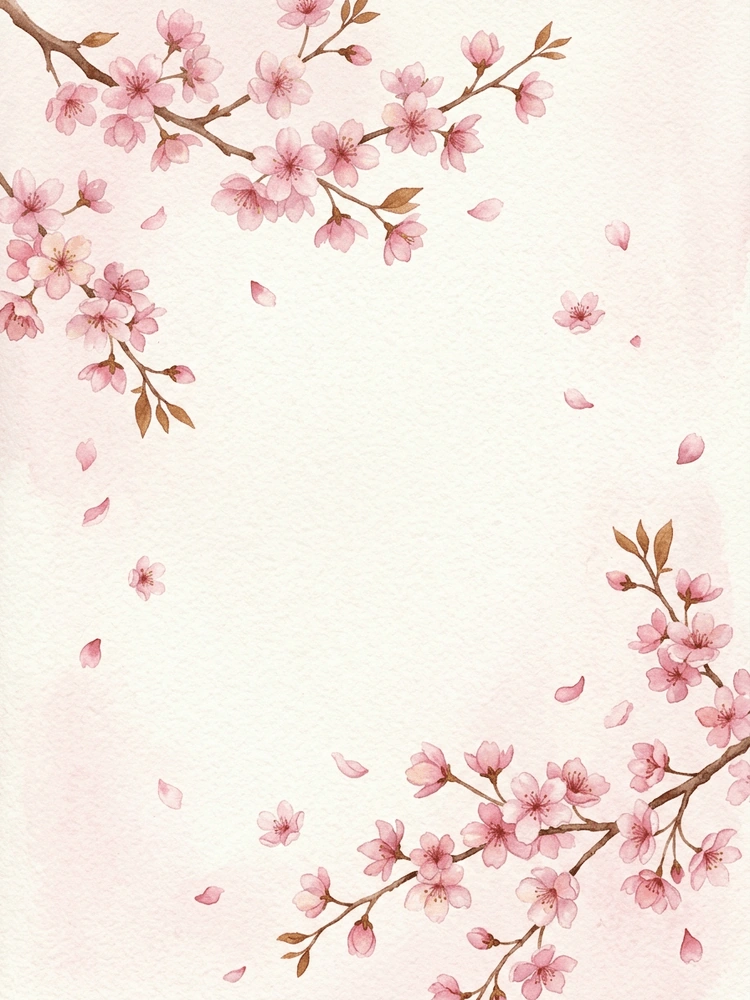
When we talk about colors that photograph well, we are looking for combinations that offer enough contrast to be readable while maintaining a soft, airy quality. The most effective palettes often lean into nature-inspired tones. A combination of sage green, dusty rose, and cream is a timeless choice. The sage provides a grounding, earthy element, while the dusty rose adds a touch of warmth. This trio is particularly effective because it avoids the "candy-colored" look that can sometimes feel juvenile, opting instead for a sophisticated, botanical feel that looks excellent on both high-resolution displays and mobile screens.
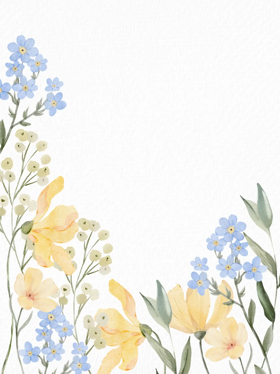
Another excellent pairing is lavender, butter yellow, and slate blue. This palette is vibrant and energetic, making it perfect for daytime parties. The key to making this work is the inclusion of the slate blue; it acts as a neutral that anchors the brightness of the yellow and the sweetness of the lavender. When photographing your invitation details—or simply sharing a screenshot of your digital invite on social media—these colors pop without causing eye strain. They provide a balanced, harmonious look that feels distinctly seasonal.
Why Digital Invitations Outperform Paper for Color Accuracy
One of the most practical reasons to choose digital invitations over traditional paper is the consistency of color. When you print an invitation, the final result depends heavily on the paper stock, the ink quality, and the lighting in the room. A beautiful pastel pink might look washed out on matte paper or overly saturated on glossy cardstock. With digital invitations, the colors you see on your screen are exactly what your guests see on theirs.
Furthermore, digital platforms allow for animation, which can make a color palette feel more dynamic. Seeing an envelope open to reveal a carefully selected palette of spring colors adds an element of anticipation that static paper simply cannot replicate. InviteDrop specializes in this experience, focusing on the tactile feeling of the reveal and the utility of a guest dashboard. While some competitors offer more complex design tools with thousands of drag-and-drop elements, we prioritize a clean, reliable experience that ensures your RSVP tracking is accurate and your invitation arrives looking exactly as you intended.
Comparing Digital Invitation Options
When choosing a platform for your spring event, it is helpful to look at the landscape honestly. Some platforms, like Evite or Paperless Post, offer a vast library of pre-made templates that can be very convenient if you want a specific theme or licensed character. However, these platforms often come with heavy branding or mandatory ads that can detract from the aesthetic of your invitation, especially if you are aiming for a high-end, minimalist pastel look.
InviteDrop takes a different approach. We focus on the core functionality: a smooth, ad-free experience that prioritizes your guest list management. We are free to start, which is ideal if you are still finalizing your guest count or testing out different color palettes. We do not offer the extensive design libraries found on more expensive, subscription-based sites, but we do offer a streamlined, intuitive interface that makes it easy to get your invitations out quickly. If your priority is a polished, professional look with real-time RSVP tracking, we are a strong contender. If your priority is an infinite variety of complex, heavily illustrated templates, you may find that other platforms have a larger selection of pre-designed art.
Tips for Maintaining Your Palette Across Your Event
To really make an impact, try to carry your invitation colors through to the party itself. If you chose a sage and dusty rose palette for your invitation, consider using those same shades for your table linens, floral arrangements, or even the drink menu. This creates a cohesive narrative that guests will notice the moment they arrive. Photography is all about consistency; when the colors of your invitation match the colors of your event decor, your photos will look intentional and curated.
Remember that pastels can sometimes be difficult to capture if the lighting is too harsh. If you are planning an outdoor event, try to schedule your photography during the "golden hour," shortly before sunset. The soft, warm light will complement your pastel palette perfectly, preventing the colors from appearing flat or overexposed. Whether you are sending your invitations out weeks in advance or just a few days before, keeping your design simple and your colors intentional will ensure your event feels special from the very first click. When you are ready to put these color theories into practice, you can design one on InviteDrop to get your spring party off to a beautiful start.