Why Photographing Your Invitations Matters
Your invitation is one of the first tangible pieces of your event, and a well-photographed invitation becomes a lasting keepsake. Whether you are sharing it on social media, preserving it in a wedding album, or sending a preview to out-of-town guests, a beautiful photo elevates the design you spent time choosing.
If you designed your invitation on a platform like InviteDrop, capturing it well lets you share that design everywhere. You do not need a professional to get great results — with a few simple techniques and the camera already in your pocket, you can capture your invitations in a way that does justice to their design. Here is how.
Lighting Is Everything
The single most important factor in invitation photography is lighting. Bad lighting makes even the most beautiful invitation look flat, washed out, or muddy. Good lighting reveals textures, colors, and details that the eye might otherwise miss.
Natural light is your best friend. Position your invitation near a large window during the day, ideally when the sun is not shining directly through. Indirect, diffused daylight provides even, soft illumination that brings out color accuracy and subtle details like embossing or metallic finishes.
Avoid overhead room lights. Fluorescent and incandescent bulbs cast color tints that distort the true colors of your invitation. If you must shoot at night, use a daylight-balanced LED panel or a desk lamp with a white diffuser. Position it to the side of the invitation rather than directly above.
Watch for shadows. When styling your flatlay, check that your hands, phone, or styling props are not casting shadows across the invitation. If shadows are a problem, move the invitation further from the window or add a white piece of paper on the opposite side to bounce light back in.
Choosing Your Background and Surface
The surface you place your invitation on sets the mood of the entire photo. Choose something that complements the design without competing with it.
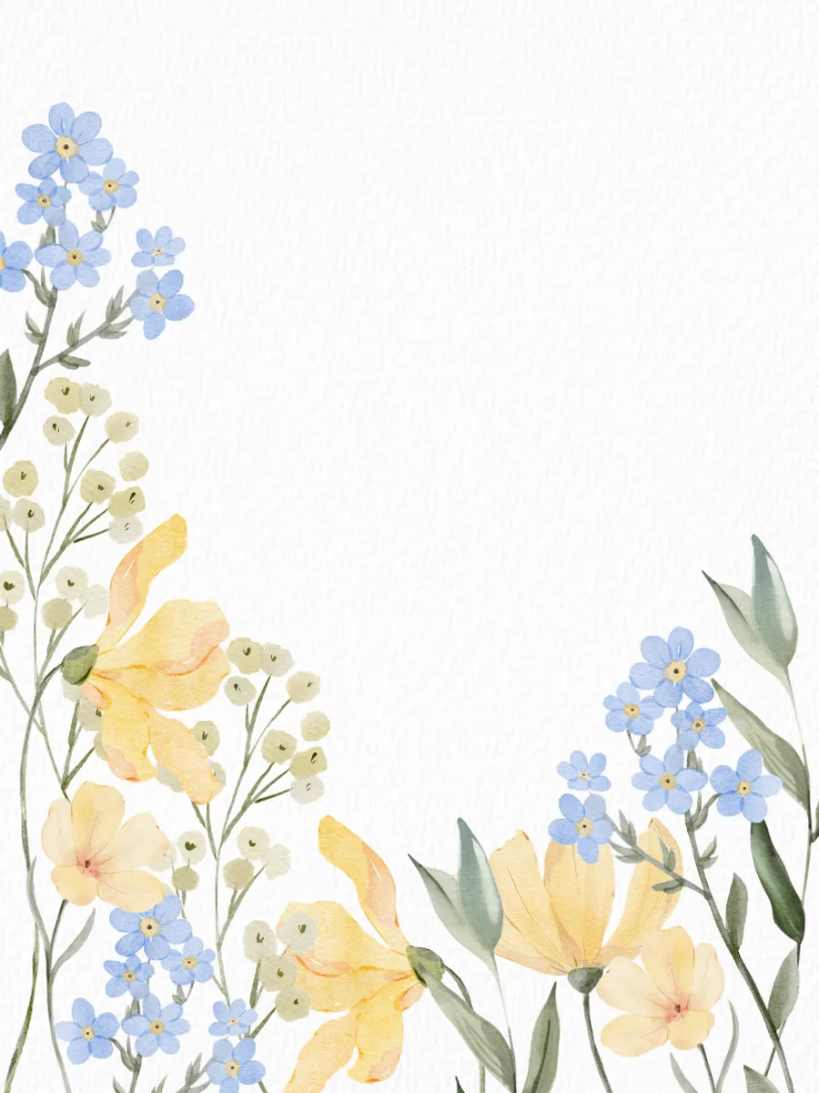
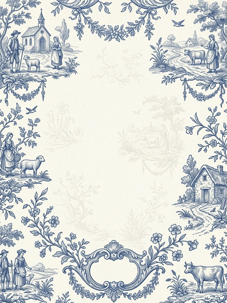
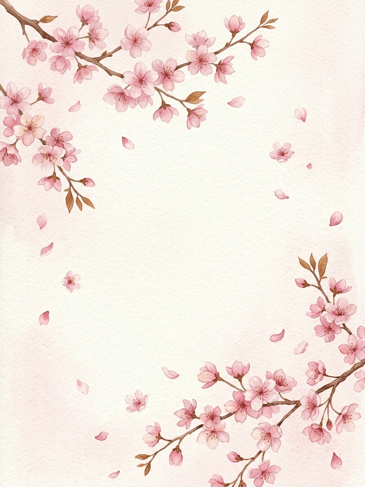
Simple surfaces that work: A marble countertop, a linen tablecloth, a wooden cutting board, a piece of textured handmade paper, or a velvet fabric remnant. Each creates a different mood — marble feels modern and clean, wood feels rustic, linen feels organic, and velvet feels luxurious.
Avoid busy patterns. A printed tablecloth, a colorful rug, or a cluttered desk will fight with the invitation for attention. The background should enhance, not distract.
Color coordination matters. Choose a background that either complements or gently contrasts with the invitation's color scheme. A warm invitation on a cool marble surface creates visual interest. A navy invitation on a cream linen feels cohesive. Avoid backgrounds that are the same color as the invitation — the edges will disappear and the design will feel flat.
Consider texture. A textured surface adds depth to the photo, even when it is subtle. The grain of wood, the weave of linen, or the veining of marble gives the eye something to explore beyond the invitation itself.
Styling Your Flatlay
A flatlay is a photograph taken from directly above, looking straight down at a styled arrangement. It is the most popular format for invitation photography because it shows the full design without perspective distortion.
Start with the invitation as the hero. Place it in the center or slightly off-center, and build the styling around it. Everything else in the frame should support the invitation, not compete with it.
Styling props to consider:
- Fresh flowers or a small sprig of greenery — choose varieties that echo the invitation's botanical elements
- Rings or jewelry for wedding invitations — adds a personal and romantic touch
- A wax seal, ribbon, or envelope liner if your invitation suite includes them
- A fountain pen or calligraphy pen — reinforces the stationery theme
- A small perfume bottle, a vintage stamp, or a spool of silk ribbon for texture variety
The rule of odds: Odd numbers of props (three or five) tend to look more natural than even numbers. Two matching items can feel static; three create visual movement.
Leave breathing room. Do not fill every corner of the frame. White space — or in this case, background space — gives the eye a place to rest and draws focus to the invitation.
Camera Settings and Technique
You do not need a professional camera. Modern smartphones produce stunning flatlay photos with a few adjustments.
Shoot from directly above. Hold your phone parallel to the surface, not at an angle. Many phones have a grid overlay option in the camera settings — turn it on to help you keep the invitation centered and the edges straight.
Tap to focus. Tap on the invitation text to ensure the sharpest focus is on the most important element. Most phone cameras will also let you adjust exposure by swiping up or down after tapping — brighten the image slightly for a clean, airy look.
Use the timer. If camera shake is an issue, set a two-second or ten-second timer so you can stabilize the phone before the shutter fires. Better yet, prop your phone on a stack of books above the invitation for a perfectly steady shot.
Shoot at the highest resolution. You can always crop later, but you cannot add detail that was not captured. Avoid using the digital zoom — it degrades quality. Move closer physically instead.
Photographing Digital Invitations
Digital invitations present a unique photography challenge. You cannot lay a screen flat and photograph it the way you would a printed card. Instead, consider these approaches.
Screenshot and share. The simplest method. Take a clean screenshot of the invitation as it appears on your screen, crop it neatly, and share. This works well for social media posts where the design is the focus.
Screen-in-scene shots. Display the invitation on a tablet and photograph the tablet sitting on a styled surface alongside props. This creates the flatlay aesthetic while showcasing a digital design. Use a tablet rather than a phone — the larger screen shows more detail and looks more intentional in the photo.
Screen recording for animated invitations. If your invitation includes animation — like an envelope opening or a text reveal — a screen recording captures the full experience. Platforms like InviteDrop create animated invitations specifically designed to look beautiful when recorded and shared.
Adjust screen brightness to maximum before capturing, and make sure there are no notification banners visible. Turn on Do Not Disturb mode to prevent interruptions during screen recordings.
Editing and Sharing Your Photos
A few simple edits can transform a good invitation photo into a great one.
Brightness and contrast: Slightly increase brightness for a clean, airy feel. Adjust contrast to make the text and design elements pop without looking harsh.
White balance: If the colors look off — too yellow, too blue — adjust the white balance or temperature slider until the invitation colors match what you see in real life.
Crop and straighten: Make sure the edges of the invitation are parallel to the edges of the frame. Even a slight tilt looks sloppy. Most editing apps have a straighten tool that makes this easy.
Sharpening: A small amount of sharpening helps text look crisp, but do not overdo it — heavy sharpening creates an unnatural, crunchy look.
When sharing on social media, consider the platform's aspect ratio. Instagram favors square or 4:5 vertical formats. Stories use 9:16. Pinterest prefers tall 2:3 verticals. Crop your photo to fit the platform rather than letting it auto-crop and potentially cut off important details.
A well-photographed invitation extends the life of your design far beyond the event itself. It becomes part of your story — a visual memory of the moment everything began to feel real. Ready to create an invitation worth photographing? Design one free on InviteDrop in minutes.