The Artistry of Watercolor Invitations
Watercolor wedding invitations occupy a unique space in stationery design — they feel both artistic and accessible, refined yet warm. The soft edges, luminous color blends, and organic imperfections of watercolor create an invitation that looks like it was painted by hand specifically for each guest, even when it is printed by the thousands.
What makes watercolor so effective for wedding invitations is its emotional quality. A bold geometric design communicates precision; a letterpress invitation communicates formality. A watercolor invitation communicates feeling — the softness of love, the beauty of imperfection, the artistry of a life shared. This guide explores the many ways watercolor can be used in wedding invitation design.
Watercolor Techniques and Their Effects
Different watercolor techniques create different visual effects, and each one brings a distinct personality to your invitation:
Wet-on-wet wash: Paint applied to wet paper, creating soft, blended gradients with no hard edges. This technique produces dreamy, atmospheric backgrounds — think sunset skies, ocean horizons, or abstract color fields. A watercolor wash as the backdrop with crisp typography overlaid is one of the most popular invitation formats.
Wet-on-dry detail: Paint applied to dry paper, creating more defined edges and precise details. This technique works for detailed floral illustrations, venue paintings, and botanical elements where clarity matters. The precision of wet-on-dry allows for intricate, realistic renderings.
Splatter and drip: Intentional paint splatters and drips that create an energetic, artistic texture. Used sparingly as accent elements — a spray of gold splatter, a single drip of color — these effects add movement and spontaneity to the design. They feel modern and art-gallery inspired.
Layered washes: Multiple layers of transparent color built up gradually, creating depth and complexity. This technique is how watercolorists achieve rich, nuanced colors — the transparency of each layer allows underlying tones to show through, creating visual depth impossible with opaque paint.
Ombre gradients: A single color transitioning from dark to light (or one color blending into another) across the invitation. Ombre effects are striking and contemporary, working beautifully as backgrounds or border elements. A blue-to-white ombre evokes ocean and sky; a blush-to-mauve gradient feels romantic and sophisticated.
Popular Watercolor Invitation Styles
Within the watercolor category, several distinct styles have emerged:
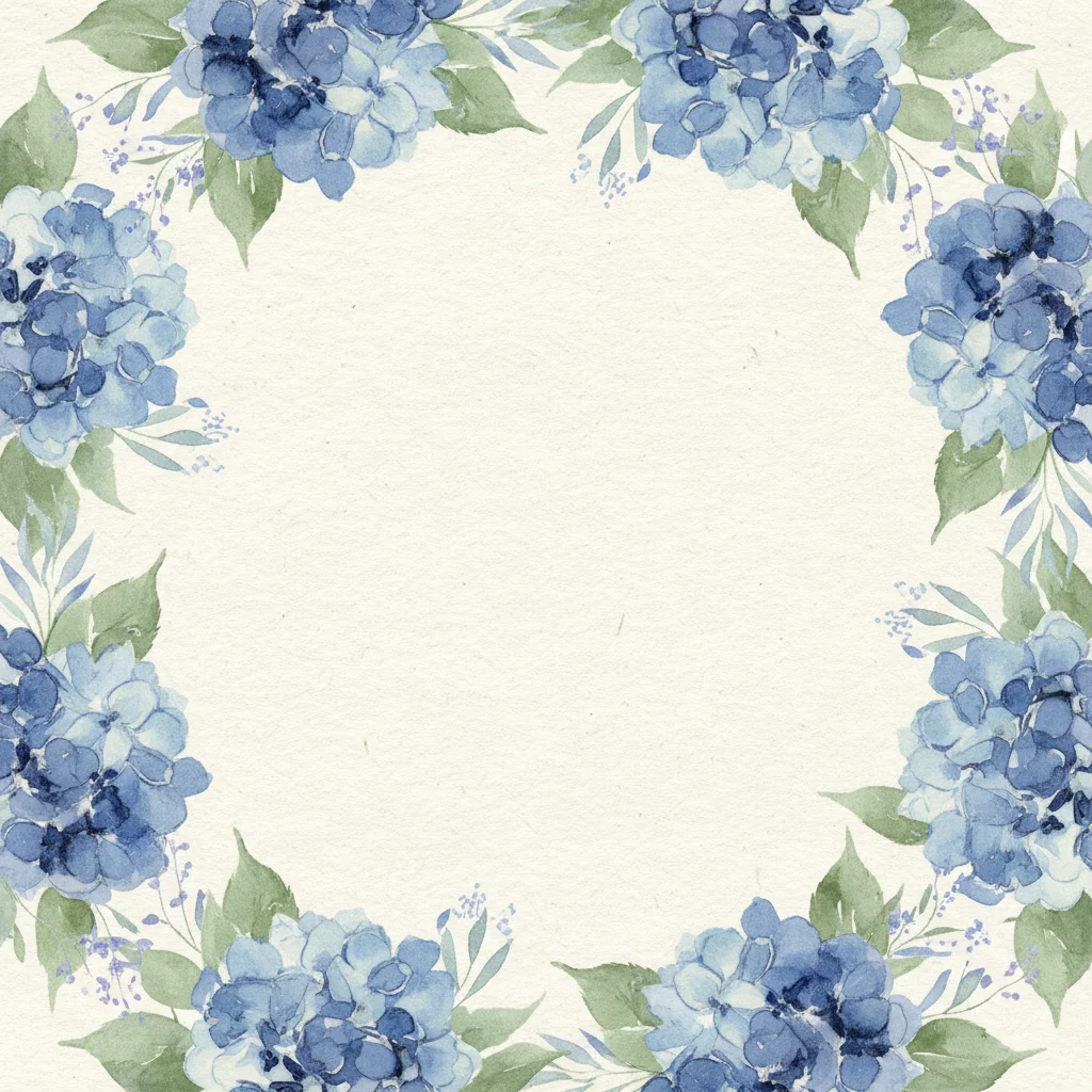
Watercolor florals: The most popular application of watercolor in wedding stationery. Flowers rendered in watercolor have a softness and luminosity that other techniques cannot achieve. From loose, impressionistic blooms to detailed botanical studies, watercolor florals suit every wedding style from garden casual to ballroom formal.
Watercolor landscapes: A painted scene of your venue, your city skyline, or the natural landscape where you will celebrate. This approach is highly personalized — no one else will have the same painting — and creates a keepsake that captures the setting of your wedding day.
Abstract watercolor: Non-representational color washes, shapes, and textures used as design elements. Abstract watercolor feels modern and artistic, focusing on color and form rather than recognizable imagery. It works well for couples who want the watercolor aesthetic without specific floral or scenic themes.
Watercolor typography: The text itself rendered in watercolor — each letter painted rather than typeset. This creates a one-of-a-kind, handcrafted look that is inherently personal. Watercolor lettering works best for names and headings, with cleaner typefaces used for smaller body text.
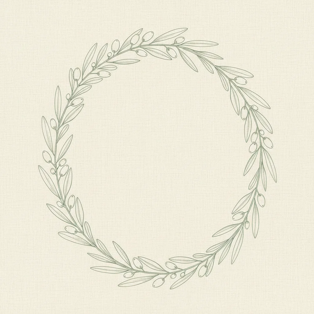
Watercolor borders and frames: Painted elements framing the text area — a wreath of watercolor leaves, a border of brushstrokes, or a loosely painted frame in coordinating colors. This approach keeps the text clear and readable while adding artistic warmth around the edges.
Watercolor maps: A hand-painted map showing the venue location, nearby landmarks, and points of interest. Watercolor maps serve a practical purpose while doubling as art. They are particularly charming for destination weddings and celebrations in scenic locations.
Color Palettes for Watercolor Invitations
Watercolor lends itself to certain color combinations that take advantage of the medium's transparency and blending qualities:
Blush and gold: Soft pink washes with gold accents — either painted gold watercolor or metallic gold foil — create a romantic, feminine look. The transparency of watercolor blush is uniquely beautiful, allowing the white paper to glow through.
Ocean blues and greens: Cerulean, turquoise, seafoam, and deep navy blend naturally in watercolor, mimicking the colors of the sea. This palette is ideal for coastal and beach weddings.
Earth tones: Burnt sienna, raw umber, terracotta, and golden ochre create warm, organic watercolor effects. These tones feel natural and grounded, suited to rustic and bohemian celebrations.
Jewel tones: Deep emerald, sapphire, amethyst, and ruby rendered in transparent watercolor layers create rich, complex colors with remarkable depth. Jewel-toned watercolor feels luxurious and dramatic.
Monochrome washes: Varying shades of a single color — multiple greens, graduating blues, or layered grays — create sophisticated, cohesive designs. Monochrome watercolor is surprisingly versatile and feels both modern and classic.
Sunset palette: Coral, peach, golden yellow, and soft lavender blended together recreate the colors of a sunset sky. This palette is vibrant but not overwhelming, perfect for summer and fall celebrations.
Working with Watercolor in Print and Digital
Translating watercolor art into printed or digital invitations requires specific considerations:
Scanning and color accuracy: If starting with original painted artwork, scanning at high resolution (at least 600 DPI) is essential. Watercolor colors can shift during scanning — blues may darken, subtle washes may disappear. Work with your printer to color-match the final product to the original artwork.
Paper choice for print: Watercolor designs look best on uncoated, matte paper that mimics the texture of actual watercolor paper. Glossy or coated paper makes watercolor images look flat and artificial. Cotton and rag papers are ideal for reproducing the tactile quality of hand-painted art.
Digital watercolor: Many designers create watercolor effects digitally using tools that simulate brush strokes, paint blending, and paper texture. The results can be virtually indistinguishable from hand-painted originals and offer easier editing and consistent reproduction.
Screen display: Watercolor translates beautifully to screens. The luminosity of backlit displays actually enhances the transparency and glow of watercolor effects, making digital invitations a natural fit for the medium. InviteDrop offers watercolor-inspired templates that take advantage of digital display to make painted elements glow with warmth and depth.
Making Watercolor Invitations Unique
Given the popularity of watercolor in wedding stationery, personalization is key to standing out:
Commission original art: Working with a watercolor artist to paint your specific flowers, venue, or a meaningful landscape ensures a truly one-of-a-kind invitation. Many artists also provide the original painting as a wedding gift or keepsake.
Paint it yourself: If you have artistic ability — or are willing to learn — painting your own invitation art adds an irreplaceable personal touch. Even imperfect, heartfelt brushstrokes carry more meaning than the most polished purchased design. Watercolor is one of the most forgiving mediums for beginners.
Incorporate personal elements: Your pet rendered in watercolor, a painting of the house where you had your first date, or your wedding venue at golden hour. Personal subjects make generic watercolor techniques feel specific and meaningful.
Combine techniques: Pair watercolor with other printing methods — foil stamping for names, letterpress for body text, or embossing for monograms. The contrast between the soft, organic watercolor and the crisp precision of other techniques creates tactile and visual interest.
Use watercolor across the suite: Extend the painted elements beyond the invitation to save-the-dates, programs, menus, place cards, and thank-you notes. A consistent watercolor thread tying together all wedding stationery creates a curated, gallery-worthy collection.
A watercolor wedding invitation is an invitation that doubles as art. It asks guests not just to attend a wedding but to appreciate the beauty and care that went into every aspect of the celebration. When the first thing your guests see is a hand-painted work of art, they know they are in for something special.