Why Color Matters in Invitation Design
Color is the first thing guests notice about your invitation — before they read a single word. It communicates emotion, sets expectations, and creates an instant impression of what your event will feel like. A warm gold and ivory palette whispers elegance. A bright coral and turquoise combination shouts celebration. Deep emerald and black suggest sophistication.
Choosing the right color scheme is not about following trends blindly or picking your favorite color. It is about selecting colors that align with your event's tone, season, and audience to create a cohesive visual experience from invitation through to the event itself.
Color Psychology Basics for Invitations
Every color carries emotional associations. Understanding these associations helps you choose colors that reinforce the feeling you want to create.
Red: Energy, passion, urgency, celebration. Works well for Valentine's Day events, Chinese New Year celebrations, and festive holiday parties. Use sparingly — too much red feels aggressive. Best as an accent color paired with neutrals.
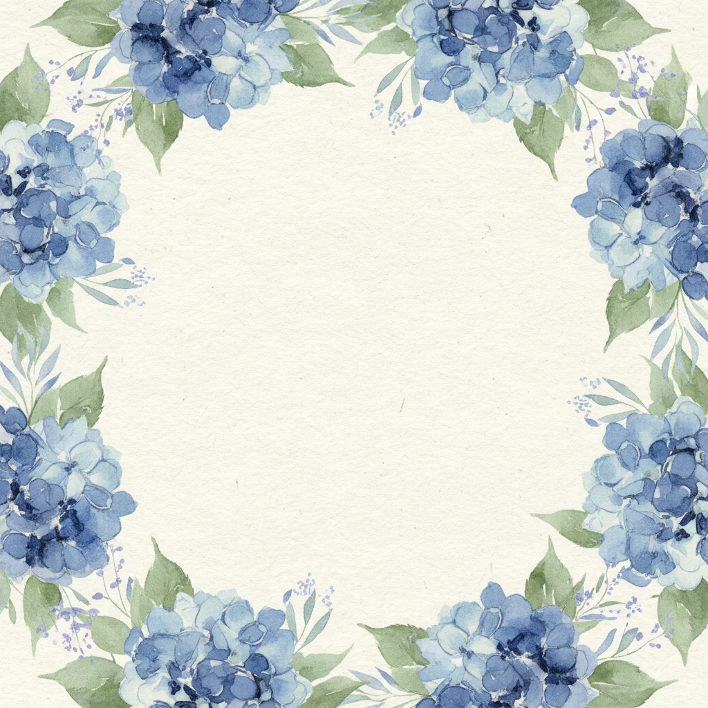
Blue: Trust, calm, sophistication. Navy is formal and timeless. Sky blue feels fresh and friendly. Royal blue conveys confidence. Blue is one of the most versatile invitation colors and works across virtually every event type.
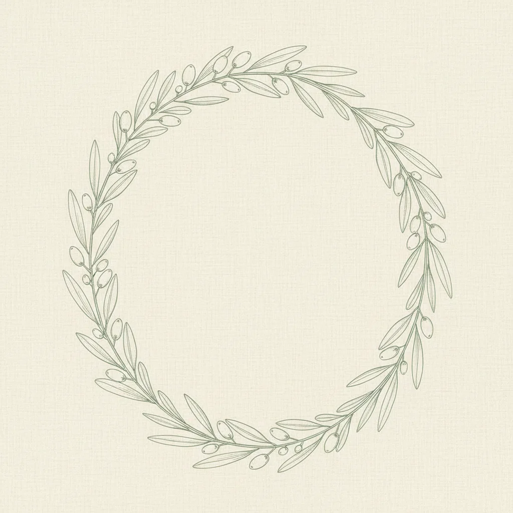
Green: Nature, freshness, growth, harmony. Sage and olive greens are trending for weddings and showers. Emerald feels luxurious. Mint feels youthful and light. Green pairs beautifully with both warm and cool neutrals.
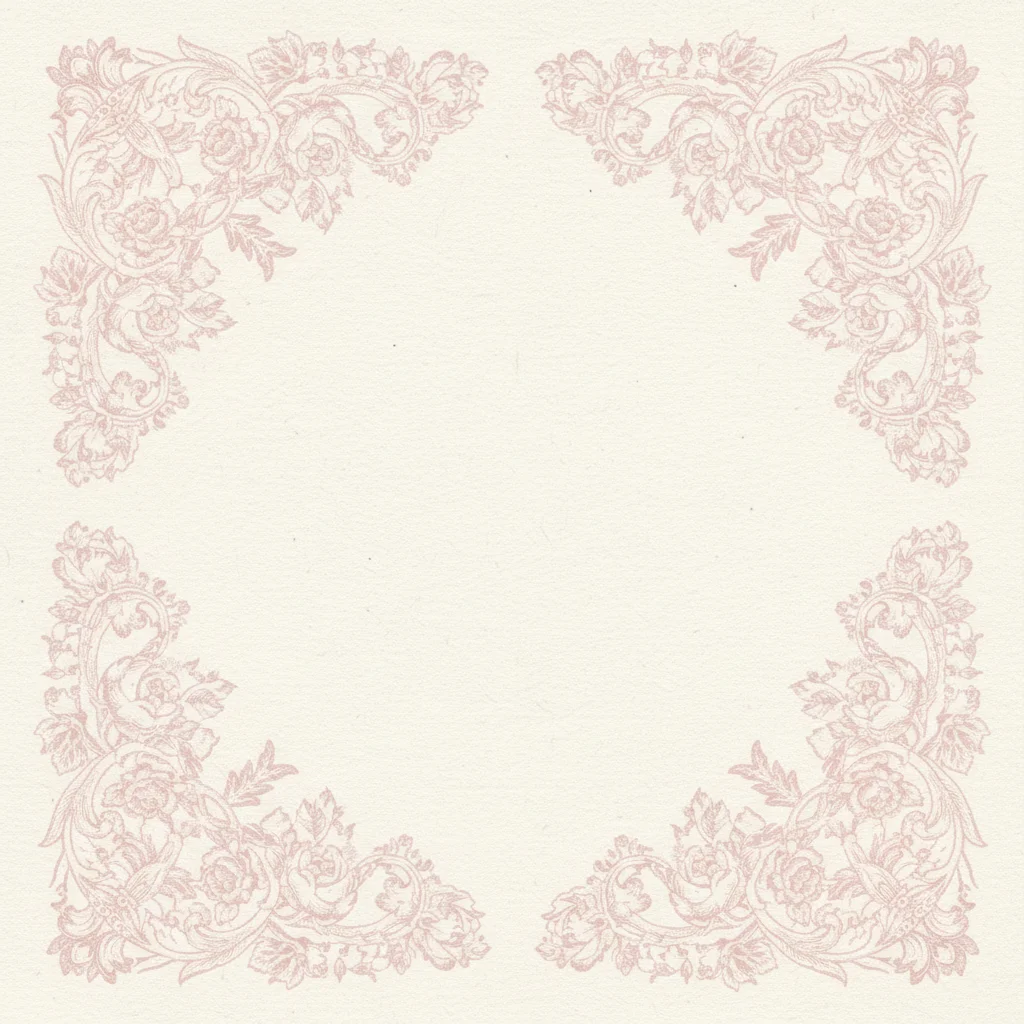
Pink: Romance, tenderness, playfulness. Blush pink is a wedding staple. Hot pink brings energy to birthday parties. Dusty rose feels vintage and sophisticated. Pink's versatility depends entirely on the shade — soft pinks feel delicate while bright pinks feel bold.
Purple: Luxury, creativity, mystery. Lavender suits baby showers and spring events. Deep plum feels regal and dramatic. Purple is underused in invitation design, which makes it a distinctive choice when you want to stand out.
Gold: Elegance, celebration, warmth. Gold accents elevate any color scheme instantly. Gold on navy, gold on burgundy, or gold on forest green are all classic combinations that signal a special occasion. Gold works as a metallic accent rather than a dominant color.
Black: Sophistication, formality, drama. Black and white invitations are timelessly elegant. Black combined with gold or silver creates a luxury feel. Use black thoughtfully — it can feel somber for celebratory events unless balanced with warm accents.
White and cream: Purity, simplicity, elegance. These are foundational colors that support rather than dominate. Nearly every invitation color scheme includes white or cream as a base, providing contrast and visual breathing room for bolder accent colors.
Building a Cohesive Color Palette
A strong invitation palette typically consists of three to four colors with clearly defined roles.
The dominant color (60%). This is your primary background or the most visually prominent color. It sets the overall mood and should be the first color people associate with your event. Neutral tones (white, cream, soft gray) are safe dominant choices because they support legibility. Bold dominant colors (navy, forest green, burgundy) make a stronger statement but require careful text color selection for readability.
The secondary color (30%). This provides visual interest and contrast. It might be used for borders, section backgrounds, decorative elements, or large text. The secondary color should complement the dominant color — meaning it looks harmonious alongside it without blending into it.
The accent color (10%). This is your highlight — used for buttons, important text, small decorative details, and calls to action like the RSVP button. Accent colors should contrast strongly with both the dominant and secondary colors so they draw the eye to where you want attention.
The neutral. Every palette needs a neutral to ground it. Black, white, cream, gray, or charcoal text provides contrast and readability. Even the most vibrant palette needs a neutral anchor to prevent visual overwhelm.
Color Schemes by Event Type
Here are specific palette recommendations for common events, including hex codes you can use directly in your designs.
Elegant wedding: Ivory (#FFFFF0) base, dusty rose (#DCAE96) secondary, gold (#C9A96E) accent, charcoal (#36454F) text. This palette feels romantic, warm, and timeless. It translates beautifully from digital invitations to physical decor.
Modern wedding: White (#FFFFFF) base, sage green (#B2AC88) secondary, black (#1A1A1A) accent, warm gray (#9E9E9E) details. This palette feels fresh, contemporary, and gender-neutral. It is particularly popular for minimalist design aesthetics.
Kids' birthday: Bright yellow (#FFD700) base, sky blue (#87CEEB) secondary, coral (#FF6F61) accent, white text. This palette is energetic and joyful without being garish. Adjust the specific shades to match any theme — swap sky blue for green for a dinosaur party, or swap coral for pink for a princess party.
Milestone birthday (30th, 40th, 50th): Black (#1C1C1C) base, gold (#D4AF37) secondary, white (#FFFFFF) text. This classic combination says "this is a significant occasion" without any additional design elements needed. It is elegant, bold, and celebratory.
Baby shower: Soft white (#FAF9F6) base, pale blue (#B0C4DE) or pale pink (#FFD1DC) secondary, silver (#C0C0C0) accent, warm gray (#808080) text. These soft, gentle palettes match the tenderness of the occasion. Gender-neutral options use sage (#B7C9A8) or warm yellow (#F5E6CC) instead of pink or blue.
Corporate event: Use your brand colors as the secondary and accent, with a clean white or light gray base. Corporate invitations should feel polished and professional. Avoid overly playful color combinations that might undermine the event's credibility.
Seasonal Color Considerations
Aligning your palette with the season of your event creates a natural, harmonious feeling.
Spring (March - May): Soft pastels, fresh greens, blush pinks, lavenders, and light yellows. Spring palettes feel light and optimistic. Pair with white or cream for a clean, airy look.
Summer (June - August): Bold, saturated colors — bright corals, deep turquoise, sunny yellows, tropical greens. Summer invitations can handle more vibrancy and energy than any other season. Citrus-inspired palettes (orange, lemon, lime) feel particularly festive.
Autumn (September - November): Warm earth tones — burnt orange, deep burgundy, olive green, mustard yellow, and rich brown. Autumn palettes feel cozy and grounded. Pair warm colors with cream rather than bright white for the most cohesive look.
Winter (December - February): Deep, dramatic colors — navy, emerald, burgundy, and plum, accented with metallics (gold, silver, copper). Alternatively, icy palettes — silver, pale blue, white, and crystal clear tones — capture the winter atmosphere beautifully. Holiday events can lean into classic red and green, but modern interpretations using forest green and cranberry feel more sophisticated.
Tools and Tips for Choosing Colors
If you are not a natural designer, these practical tips will help you build a palette you love.
Use a color palette generator. Tools like Coolors, Adobe Color, and Canva's palette generator let you explore harmonious color combinations quickly. Start with one color you love and let the tool suggest companions.
Pull colors from an image. Find a photo that captures the mood you want — a sunset, a bouquet of flowers, an interior design photo — and extract colors from it. This technique produces naturally harmonious palettes because the colors already coexist beautifully in the source image.
Test on screen, not just in theory. A color combination that looks gorgeous on a swatch card might fall flat on a phone screen. Always preview your full invitation design with your chosen colors before committing. Platforms like InviteDrop let you see how colors look in the context of a complete invitation template, making it easier to evaluate whether your palette works in practice.
Consider accessibility. Approximately 8% of men and 0.5% of women have some form of color vision deficiency. Avoid relying solely on color to convey information — pair color with text labels, icons, or patterns. Ensure sufficient contrast between text and background colors so that every guest can read your invitation comfortably.
Less is always more. When you are unsure, simplify. A two-color palette executed well always looks better than a five-color palette executed poorly. Start minimal and add colors only when they serve a clear purpose.
Your invitation's color scheme is the visual foundation of your event's identity. Choose colors that feel authentic to the occasion, work beautifully on digital screens, and create a cohesive thread from the moment a guest opens your invitation to the moment they walk through the door. Browse invitation templates on InviteDrop to see how different color schemes come to life in professionally designed layouts.